When Robin and Sarah from GATHER Events asked me to be a part of their rehearsal dinner styled photo shoot, I was excited. When they explained their concept to me, I was ecstatic! Basically they handed me this inspiration board:
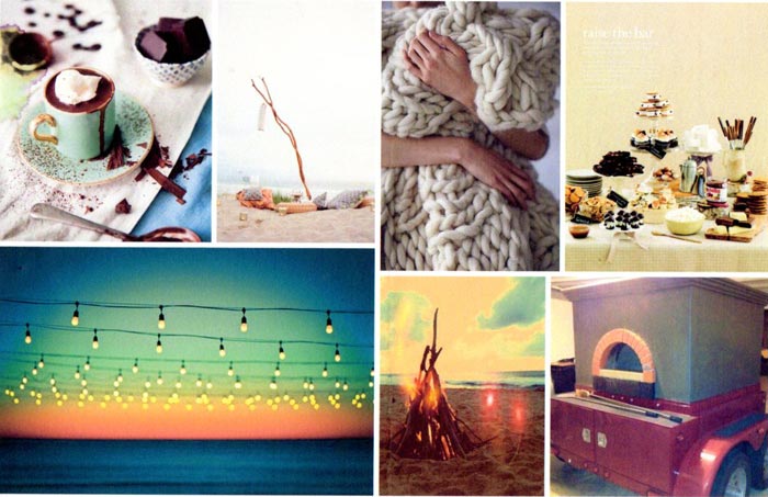
I was immediately in love with the textures — grainy sand, thick cable knit blanket, smooth marshmallow-y desserts. Then I was enraptured by the colors — creamy white, hazy smoke from the fire against the gradient of the sunset. It felt sumptuous yet cozy, casual and inviting. Needless to say, I was incredibly inspired!
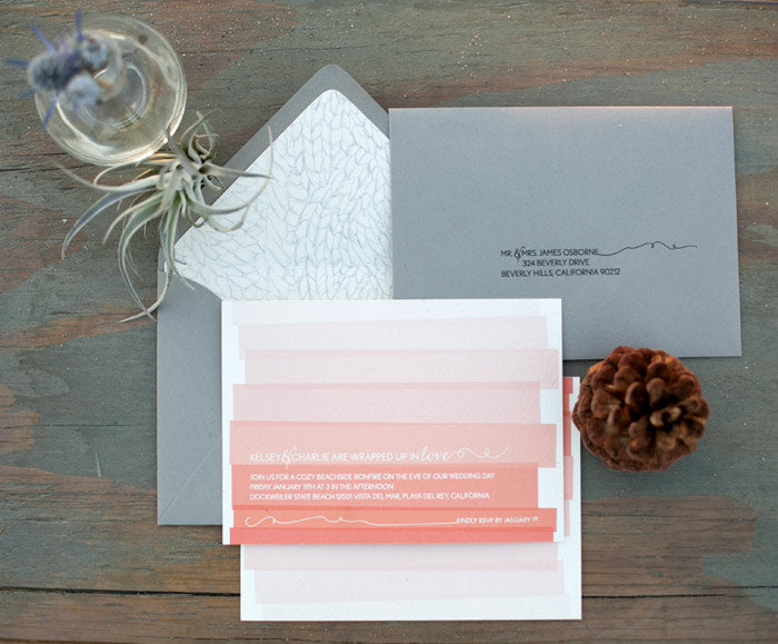 The cable knit from the inspiration board lead to the hand-drawn envelope liner which is contrasted with a graphic interpretation of the sunset gradient on the invitation. Yarn from the cable knit is also referenced with the twirl-y flourishes that accent the text on both the invitation and the mailing address. The color palette includes warm tones on the invitation which is then placed into the smokey grey envelope.

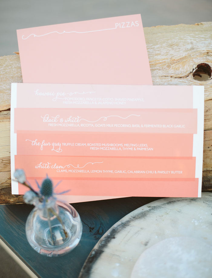
The typographic elements and graphic sunset gradient featured on the invitation were echoed in the menu design. Drinks were skillfully concocted by Pharmacie and pizzas were baked in Urban Pie‘s mobile (yes, mobile!!) wood burning oven.
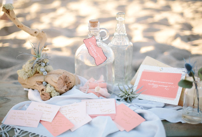 Given that we were on a beach, it only seemed natural for the guest book to take the form of a “message in a bottle”. We tweaked it slightly and called it “wisdom in a bottle” encouraging guests to give some words of advice to the soon-to-be-wed couple. To make it a little more authentic, Robin and Sarah burned the edges of the sign hanging on the glass jug to give it texture and lend a little bit of a smokey quality to it.
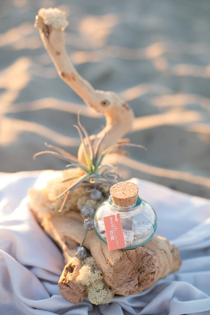 The favors — delicious “Pigments” by Petite Pig — are in a glass jar sealed with a cork and a tag that reads “Mint to be”.
Check out the entire shoot from this talented team assembled by GATHER Events and featured on 100 Layer Cake!
Photography: Heather Kincaid // Concept, Event Design, Florals, Production, Styling: GATHER Events // Furniture, Custom Napkins, Pillows, Styling: Borrowed Blu // Hair & Makeup: Tara Dowburd-Luftman // Pizza: Urban Pie // Favors: Petite Pig // Cocktails: Pharmacie
Comments (0)
I have a confession to make: My name is Rachel and I am addicted to ampersands. I get a rush if I throw one into a sentence in lieu of “and”. It’s not the proper way to write prose, I know that. But it just feels so damn good! So succinct. One character. But email fonts rarely give me the true high that I seek. The ampersand for Helvetica or Times New Roman are good and all, but sometimes I just need that fix. You know… the good stuff.

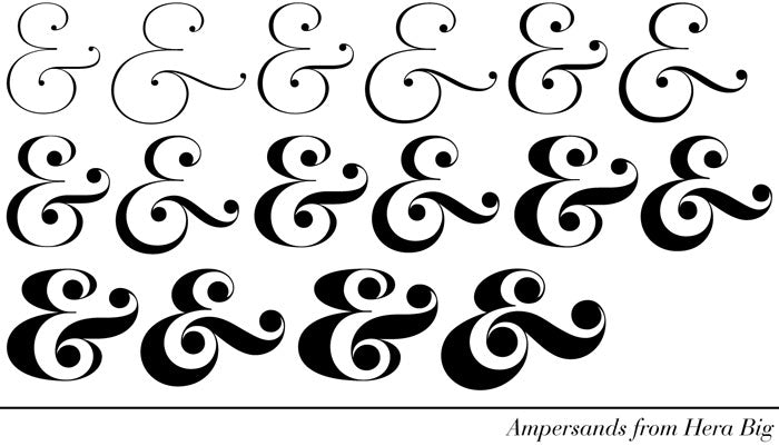
A “good” ampersand may be comprised of any combination of characteristics. Some are very simple with well balanced thick and thin lines while others are quite ornate with big swoops and swirls. I will say this — if I go too long without a good ampersand, I develop a case of the cold sweats. So, the fact that “Lupa & Pepi” has an ampersand in it may or may not be a coincidence. When I sat down to draw logo sketches for Lupa & Pepi I began to sift through my mental card catalog file of ampersands and pick one to design with. I didn’t get too far as once I got to Hera Big, my heart skipped a beat. I knew I had found my fix. The abundance of options (above) in the weight and that fantastic cross-bar swath with big circles on either side feels casual, effortless and approachable yet polished and considered with a hint of style.

With the ampersand font selected, I wanted to incorporate a graphic element to give a subtle sweet touch. I began experimenting with ways in which I could incorporate a heart into the design of the ampersand. The digital sketches (above) illustrate my thought process. The “winning” ampersand (far right) feels well-balanced in that the heart is the same scale as the other circles on the ampersand and the small space between the bottom of the heart and the cross-bar creates an implied connection without literally touching. I won’t get cheesy and bore you with the metaphors that I felt this represented when it comes to my papergood designs rather let’s just skip to the final logo design:

The words “Lupa” and “Pepi” are typeset in Hera Big Extra Light while the ampersand (a.k.a. the pièce de resistance) is based upon Hera Big Light Italic with the small addition of the heart. And that’s how I got my ampersand fix!
Comments (0)

Ciao Amici!
It’s a big year! Not only am I starting this blog… I am also getting married in June! (So excited!!) Between all of the gown shopping, venue hunting and cake tastings, I am designing all of the papergoods for the entire affair. And by “all” I mean e-v-e-r-y-t-h-i-n-g! First up? Our Jack & Jill shower invitations. A few weekends ago my fiancé, Jason, and I were lucky enough have a Jack & Jill shower thrown for us at Mozza here in LA. Because the party was scheduled for a Friday evening and both guys and girls were invited, I wanted to design something that would evoke the convivial spirit of the evening while not getting too “girly”.
The first design element that popped into my head was the font Birmingham. I downloaded this font (for free!) months ago and have been eager for the opportunity to design with it. This quirky serif font with extra wide W’s, M’s and A’s embodies a sweet, handwritten quality that fit the vibe of the evening: casual elegance with a bit of personality. Complementary to the font, a hand drawn frame and illustrations of hearts and arrows are integrated with the typography to define the space. Lastly, to make sure everyone knew who the “Mr. & Mrs. to be” was, Jason and I did silhouette drawings that I then scanned and placed into the layout. As for the color palette — a pop of persimmon on an otherwise monochromatic invitation is carried over to the envelope color and punctuated with the heart and arrow strategically placed on the envelope liner.
And so begins the parade of papergoods that I will be creating in the upcoming months for our wedding…
Comments (0)

I could not be more thrilled to be typing my very first blog post on my brand new website! A grande grazie to the Roundhouse Designs guys who totally rocked building the pages that comprise this site. Not only are they programming rockstars, they even taught me a new word: skeuomorphism — they're so smart! My site is going live just in time for the annual design blogger conference, ALT Summit. Before I jet to Salt Lake City to hob nob with fellow bloggers, let me whet your appetite with a few things you can expect on my corner of the world wide web:
~ A sneak peek behind the scenes at the design process and the inspiration for Lupa & Pepi's custom and ready-made papergoods. You'll also have a front row seat as I face the ultimate design challenge: designing paper goods for my own wedding!
~ While design has my heart, food occupies my mind! The evidence? My Instagram feed. On the blog, I will share favorite recipes, culinary adventures and my attempts at cracking the code of my great-great-aunt's (she's the "Lupa" of "Lupa & Pepi") recipe book. She never wrote down a recipe without omitting an ingredient or altering measurements for fear one of her friends would claim the recipe as her own!
~ The women in my family have had tremendous influence on me and serve as the inspiration for the name of my company. My mom — known around here as MamamiaRita — will be a regular guest contributor, sharing everything from classic pasta recipes to sage advice. She is one amazing lady! You will rarely see her in the kitchen, yet there's always a home-cooked multi-course meal on the table at dinner time. Maybe if you ask nicely, she'll tell you how she does it!
Ok, time to dash off to the airport!
Arrivederci!
Photos by Lupa & Pepi. Left to right: Custom papergoods order, our Thanksgiving table setting, homebaked Cornflake Chocolate Chip Marshmallow Cookies from the Momofuku Milk Bar cookbook, MamamiaRita and Me at Eataly in New York City
Comments (1)

 The cable knit from the inspiration board lead to the hand-drawn envelope liner which is contrasted with a graphic interpretation of the sunset gradient on the invitation. Yarn from the cable knit is also referenced with the twirl-y flourishes that accent the text on both the invitation and the mailing address. The color palette includes warm tones on the invitation which is then placed into the smokey grey envelope.

 Given that we were on a beach, it only seemed natural for the guest book to take the form of a “message in a bottle”. We tweaked it slightly and called it “wisdom in a bottle” encouraging guests to give some words of advice to the soon-to-be-wed couple. To make it a little more authentic, Robin and Sarah burned the edges of the sign hanging on the glass jug to give it texture and lend a little bit of a smokey quality to it.
 The favors — delicious “Pigments” by Petite Pig — are in a glass jar sealed with a cork and a tag that reads “Mint to be”.
